
# Insights from Policygenius
author: Tomasz Grynkiewicz
# The Policygenius story
The Policygenius story goes as follows: back in the day, two McKinsey consultants were advising insurers on growth and marketing strategies. They found a repetitive pattern: the insurers didn’t have a clue how to engage with customers online. So they decided to start their own company to tackle that challenge.
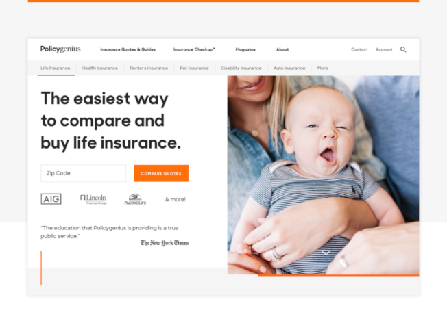
In 2014, Jennifer Fitzgerald and Francois de Lame founded PolicyGenius (recently rebranded Policygenius), an online insurance brokerage focusing on easy policy comparison.
The Brooklyn-based startup took the insurance industry by storm. They quickly raised the bar for customer experience and raised more than $50m from investors. But their secret weapon that won users’ hearts was their exceptional digital experience. Right now, Policygenius has more than 4.5 million shoppers, and has placed over $20 billion in coverage for American families.
To get to the bottom of that successful ride, I spoke to Justin Ternullo, Chief Design Officer at Policygenius. Before you jump in (highly recommended), you can taste what their digital experience feels like.
# Transforming the industry
# Tomasz Grynkiewicz, Senior Editor at Netguru: Policygenius, a young startup, is teaching the good old boys from the insurance industry how to grow to 4,5 million shoppers in a short amount of time. I bet the traditional insurers aren’t happy.
Justin Ternullo, Chief Design Officer at Policygenius: You would be surprised. If I weren’t in this company, I would assume the narrative is kind of a David and Goliath thing, pulling out a slingshot and trying to take down the big guys.
That’s a catchy headline, but that is just not the real story. Traditional insurers don't necessarily move as quickly as we can. But, at the end of the day, we're selling their products. It’s not an adversarial relationship.
# If they do well, you do well?
Exactly. Insurers know that change is upon them. The life insurance salesforce is ageing, the average age of an agent is 59 or something close. So they know that they need to figure out a new direct path to the consumer.
Distribution is a huge part of our focus, and we're building relationships with these carriers. We’re partners, not competitors. They’re excited about what we're doing in the space.

# How hard is it to design in a such regulated, stringent and formal environment? Banking and insurance seem to be tough nuts to crack.
Yes, the fintech world and financial services, in general, have added regulation. Inevitably, it limits us or adds layers of friction that would otherwise not be needed. For example, we can’t incent shoppers in ways that would be very standard for a typical e-commerce experience.
But honestly this space has more opportunities than restrictions. We’re building the digital version of a user’s decision journey, the emotional path to protect their stuff, themselves, or their family. Just within insurance, it’s easy to see how much room for improvement there is on this front.
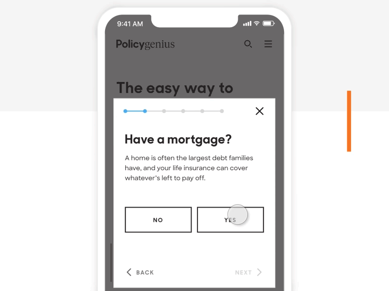
Whether we’re on the phone with one of our clients, or designing a new piece of the experience - we focus on the conversation, the feedback, the encouragement and education they need. That helps us to stay anchored as a design team and keep our eyes trained on just how much better the journey could be.
# The consumer mindset
# Founders of Policygenius got you on board as chief of design early on. It might be a bit of a surprise - a lot of people claim that all problems could be solved by tech and tech only.
Great point. When you’re trying to change the consumer mindset around a dinosaur industry with a less-than-trustworthy reputation, design plays a key role. The founders knew that from the beginning.
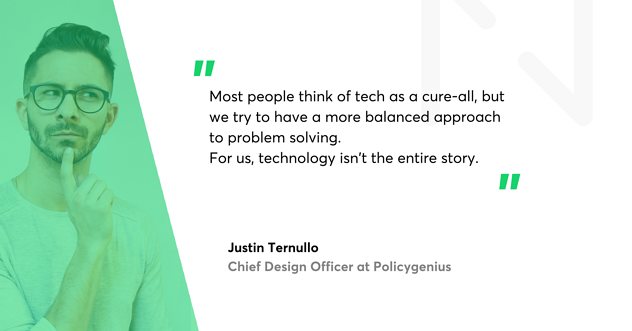
And yeah, most people think of tech as a cure-all, but we try to have a more balanced approach to problem solving. I think of it as offense and defense (though I’ve never played a sport in my life). When most people think of tech startups, they think of the “offense” - innovation, disruption, using technology to push for change. And this is a huge part of what we do at Policygenius. There's a reason why we had the first-in-the-nation online life-insurance marketplace. That’s a part of the nature of being a tech startup, that's in our blood.
But the “defense” piece is equally important. Real impact doesn’t just come from pushing boundaries, being on the bleeding edge with tech. It’s also about acknowledging the reality of working in a slow-moving industry with ancient technology. If we ignored that we’d be trying to solve problems with one hand tied behind our backs. For us, technology isn’t the entire story. It’s a tool we use to make our expertise more accessible.
# The main challenges
# So what are the major pains and obstacles for one of the hottest NY insurtech companies?
Ha. The challenges are similar to other tech startups. Number one being - finding designers that see themselves primarily as problem solvers. Not an easy task, though.
# I think that’s everybody’s anxiety nowadays - the shortage of right people to fit the team. Any other challenges?
Keeping people hyper-focused on their hypothesis and speed. Making sure we keep everybody on the same page. Pretty standard ‘team stuff’.
The main challenge for us, as we push to make the journey easier, is to make sure the experience reflects our values and the way we communicate internally.
# What do you mean by that?
Well, one of our users once said: “I always thought that if I found a friend who understood insurance and we sat down over a beer, we could figure out what I need. And he could just explain everything to me and show me my options. That's what Policygenius felt like”.
We’re not 100 percent there yet, for sure, but that’s a great North Star for what we’re really trying to do here.
# Values and practices
# To head for the North Star, you need some routine.
True. We have some solid design practices, the table stakes for every Policygenius design. Our designs are always:
- Solutions - we begin with the problem we’re solving for the user, and we end with that.
- Contextual - we unearth the full context (user, market, team) and reveal critical constraints (industry, tech).
- Structured - we create well-organised, scannable experiences with an emphasis on content hierarchy.
- Efficient - we convey simplicity by doing more with less.
- Hardened - we account for the many ways users experience our designs. Nothing is precious or brittle.
# A lot of mottos...
Fair, but we use those more to keep everyone aligned on the basics so we can spend our time on the tough stuff. That’s where our principles come in. They remind us what makes a good design, great. They have perspective. They’re not just empty phrases created to induce head nodding.
# Can you give me an example?
Sure - one of the key principles is “IRL, not URL.” When we design we imagine the interaction happening in real life (IRL). This helps us tether ourselves to the emotional experience of the user. Otherwise, it can be easy to lose the human to human connection amidst a bunch of cold screens.
Another principle is “Balanced Education.”
# Education? I thought you were just selling insurance products online.
Well, we’re building real relationships with our customers. That means acknowledging that most of the time people don’t understand this stuff and don’t know what they really need.
# Hence the education angle?
Exactly. We’re making it easy to build, manage, and understand your financial safety net. This often requires education to really empower folks to make smart decisions.
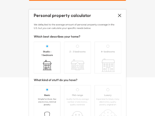
Balance is key so we focus on progressive disclosure: what does the user need to know, and when? The key is providing support without overwhelming.

# Review the milestones
# Looking back four years, what are you the most proud of?
I remember the beginning when we were testing a simple PDF version of our Insurance Checkup. We joked about how great it would be when the founders didn’t have to hand type every recommendation. Looking back just the last four years, how much we’ve grown and how much we’ve built, it's impressive. I don’t pat myself on the back a lot, but I’m definitely proud of the team we’ve built. These guys are dedicated and resourceful, and the main reason I don’t mind getting out of bed in the morning.
To be more specific - one of my happiest moments here was launching our rebrand this past December. When I joined the company, my role was mainly about getting the team up and running, delivering an MVP and helping the founders execute on their vision. Developing the brand (at the time we were called KnowItOwl) was not a focus, and definitely not my forte.
The rebrand touched every single piece of our codebase, and had to be launched before our first big marketing campaign. We were about to become much more visible across the country, so the clock was ticking.
My designers had to translate our new brand identity across the entire experience. The entire team delivered, on time, a new, beautiful experience. We got great feedback on it and, most importantly, we finally got escape velocity from my mediocre branding.
After launch, we presented the data around impact during one of our internal demos (we have them every Friday, and they’re open to the whole company). We said: “We’ve seen this much increase in conversion, we’ve seen this much engagement, etc.”. It was important that everyone on the team knew that this was about more than just a new face.
# Any disappointments you’ve encountered during that time?
For sure. As a growing company, where we typically fell short was around nailing our product process. Maybe the MVP wasn’t minimal enough. Maybe we focused a little bit on the wrong thing, on the feature that wasn’t going to provide the most impact for users. Maybe there was more churn than needed. All the little things that add up.
# Innovations in tech
# Voice, artificial intelligence, biometrics - there are a lot of innovations going on in tech. How might they impact and change the design environment?
We see these developments from time to time, whether it’s snapping a photo of your license plate to get car insurance or using your Google home device to apply for life insurance. I love to see these things push the space. But where we tend to have the most impact for our customers is in innovating on things that aren't quite as sexy. These technologies certainly change the landscape but we try to separate out the novelty, from the real utility. There’s so much potential for simplifying the insurance journey by simply harnessing the tech that already exists.
# Inspiration benchmarks
# Policygenius is itself a great example of design thinking in action. However, if you were to share other projects you find inspirational, which ones would you choose?
There’s a bunch of people in the industry that are doing a great job. But I’ll give two examples. First, TurboTax, the tax preparation software - kind of an unlikely champion.
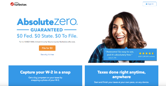
It used to be seen as a straightforward input/output software experience, a slightly more robust calculator. But over the years their product and design thinking has expanded.
They’re outstanding at leaning on behavioural psychology. They guide you from complete ambiguity, not knowing much about how to do your taxes, to feeling confident you’re good to go, and everything is buttoned up. They do this by heavy handedly reminding the user where they are in the journey, what calculations TurboTax is doing in the background, and continuously driving home that everything has been ‘double-checked’. Sounds a bit silly, but here is no way you can leave their product without knowing how they helped you.That’s important for a product you only use once a year. They are great at making it clear why you want to return next year. So I tip my hat to them.
# The second example?
Digit, an automated savings app. Their team has done a great job on the engagement side. Digit, back in the day, figured out how to weave their way into my brain and stay there.
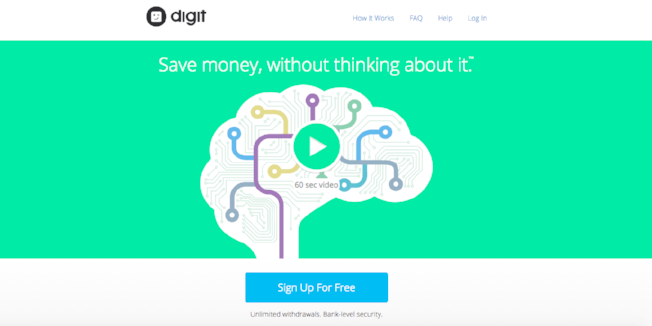
First, they took an intimate channel - texts on my phone, and hooked me with their onboarding (a series of well targeted Bill Murray GIFs and pitch perfect copy). Then they made themselves useful by sending daily bank account balances and updates on how much they were saving for me. They pepper interactions with programmatic GIF responses for delight, and impressively simplistic text-based commands. I think Digit is an excellent example of knowing your audience and prioritizing emotional, human to human connections.